Insights into Automotive Industry
Project Overview
This project aims to analyze COVID-19 data to understand the distribution and impact of the pandemic across different countries. It focuses on the total number of cases and deaths and visualizes the data for a clear understanding of which countries have been most affected.
Objectives
- To clean the COVID-19 dataset by excluding non-country data entries.
- To analyze the total number of cases and deaths for each country.
- To visualize the data for a clear understanding of which countries have been most affected.
Methodology
1. Data Preparation: Data was loaded from a CSV file into MATLAB using the readtable function. Rows containing aggregate data labeled 'World' and 'High income' were excluded to focus on individual countries.
2. Data Analysis: The dataset was grouped by country, and the maximum values for total cases and deaths were calculated to avoid duplication from daily records. Data was sorted to identify the countries with the highest number of cases and deaths.
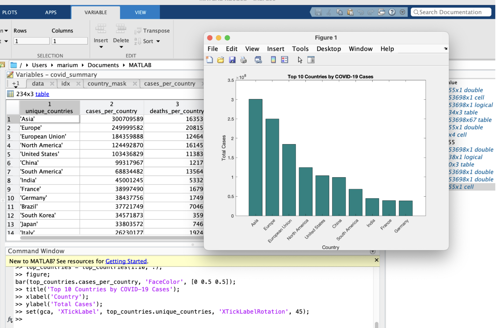
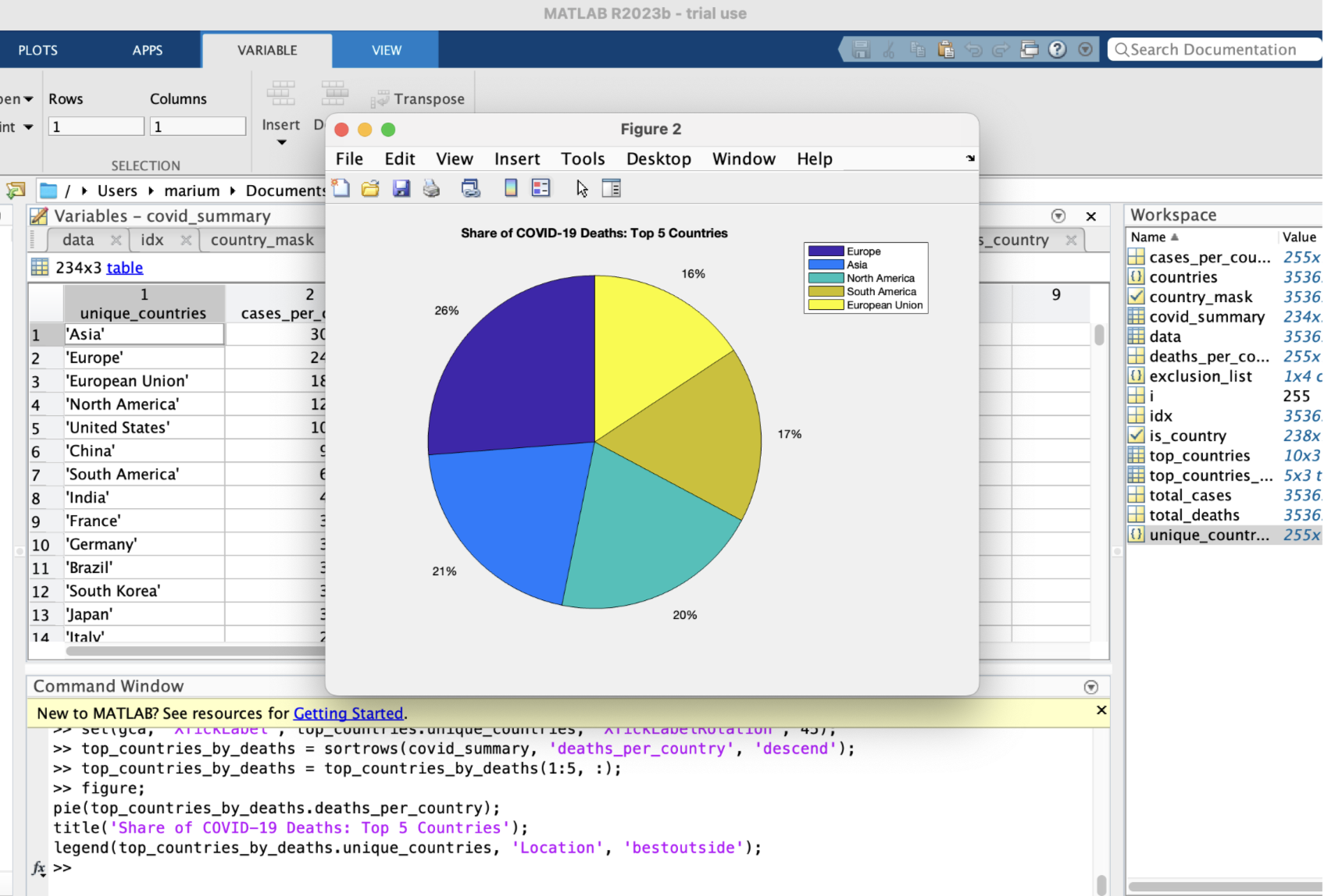
3. Data Visualization: Bar charts were created to represent the top 10 countries with the most cases and deaths. A pie chart was generated to illustrate the proportion of deaths among the top 5 countries.
Challenges and Solutions
Data Exclusion Challenges
- Initially, the exclusion of non-country data was not implemented, leading to a misrepresentation of the data analysis.
- Solution: Implemented logical indexing in MATLAB to filter out the rows corresponding to 'World' and 'High income'.
Visualization Challenges
- Difficulty in selecting appropriate visualizations that accurately represent the data distribution.
- Solution: Chose bar and pie charts for their ability to convey categorical data clearly and intuitively.
Coding Challenges
- Errors in MATLAB code due to variable naming inconsistencies and index mismatches.
- Solution: Code was meticulously debugged and corrected for variable names and indexing to ensure accurate data manipulation and analysis.
Results
- The cleaned data showed the varying impact of COVID-19 across different countries.
- Visualizations effectively highlighted the countries with the highest burden of cases and deaths.
Conclusion
The project successfully cleaned, analyzed, and visualized COVID-19 data to provide insights into the pandemic's impact on a country-by-country basis. The methodologies and visualizations chosen proved to be effective in communicating the severity of the situation in the most affected countries.