Advanced SQL Analytics on Sales Data
End‑to‑end sales analytics directly in SQL on top of a star‑schema data warehouse, using window functions, CTEs, and segmentation logic to answer real stakeholder questions.
1. Project Context and Goals
This project extends a previously built SQL data warehouse by
focusing on advanced analytics directly in the database layer. The
core model is a star schema with a central
fact_sales table and supporting dimensions such as
dim_customers and dim_products, all
exposed through a curated Gold schema. On top of this, I designed a
series of analytical queries that evaluate business performance
across time, products, categories, and customer segments, without
relying on external BI tools.
Each analysis block is tied to real stakeholder questions like “How is revenue trending?”, “Which products are over‑ or under‑performing?”, and “Who are our VIP customers?”. The emphasis is on SQL that is both interpretable for non‑technical audiences and flexible enough to power dashboards and data products.
2. Data and Methodological Approach
All analyses run in the datawarehouse database using
only Gold‑layer tables, ensuring consistent business logic and
standardized measures. Working at this level means that upstream
cleaning and modeling have already been applied, so the SQL focuses
on analytics rather than data wrangling.
Methodologically, the project relies on aggregations and
GROUP BY for summarizing sales by time, category, and
segment; window functions for cumulative metrics, moving averages,
and year‑over‑year comparisons; CTEs to keep multi‑step logic
readable; and CASE expressions to define price bands
and customer segments that can directly drive business decisions.
3. Time‑Series and Trend Analysis
3.1 Monthly Sales Dynamics
The first analysis explores monthly sales dynamics at a year‑month level. By aggregating revenue, quantity, and distinct active customers, I create a time series that reveals seasonality, peak periods, and shifts in the underlying growth drivers (more customers, larger baskets, or both).
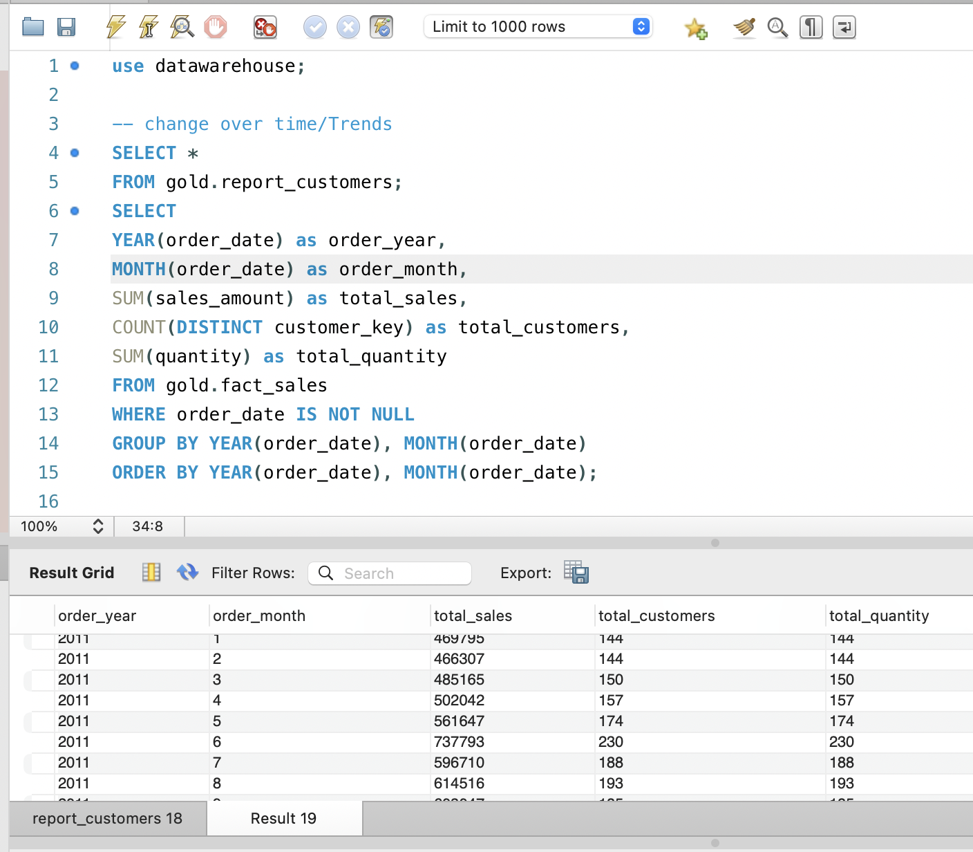
Visualizing this output highlights seasonal peaks and also acts as a data‑quality check: any gaps or anomalies in the time axis become immediately visible when plotted, making it easier to catch missing data or integration issues early.
3.2 Cumulative Revenue and Moving Averages
To obtain a more strategic view, I roll sales up to the yearly level and compute a running cumulative total and a moving average using window functions. The cumulative measure shows how much revenue has been generated over the entire observed period, while the moving average smooths year‑to‑year volatility.
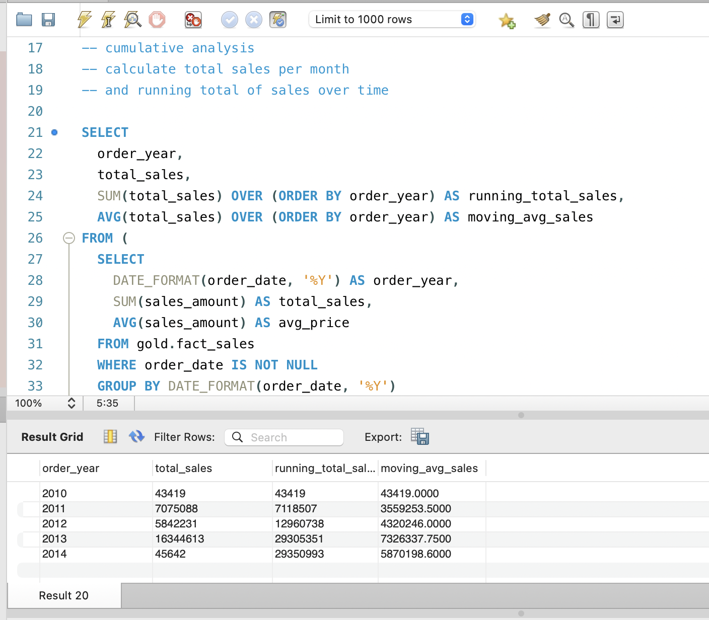
Together, these metrics help answer questions like “Is our growth accelerating or flattening?” and “How resilient is revenue to short‑term shocks?”, and are ideal inputs for dashboards that combine bars for yearly totals with lines for cumulative and smoothed trends.
4. Product‑Level Performance Analysis
4.1 Comparing Products to Their Historical Baseline
At the product level, I compute yearly sales per product and then compare each product‑year to its own historical average annual sales. This classification labels each product‑year as “Above Avg”, “Below Avg”, or “Avg”, which makes it easy to identify consistently strong performers and items that are drifting downward relative to their past.
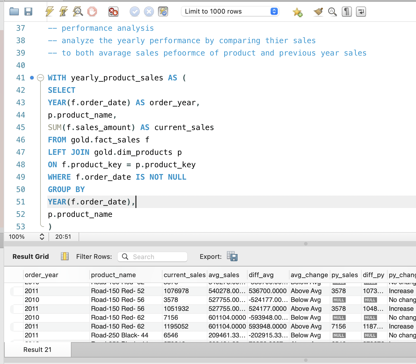
For portfolio managers, this view is more meaningful than a single global benchmark because it respects each product’s own history and context, highlighting where intervention or further investigation is needed.
4.2 Year‑over‑Year Growth and Decline
In addition to the historical baseline, I compute year‑over‑year changes using window functions that bring in the previous year’s sales per product. This produces both absolute and percentage change, along with labels such as “Increase”, “Decrease”, and “No change”.
This perspective highlights turning points in product performance: historically strong products that show a recent “Decrease” warrant attention, while sudden “Increase” cases can be analyzed for positive levers such as successful campaigns or packaging changes.
5. Category Contribution and Part‑to‑Whole Analysis
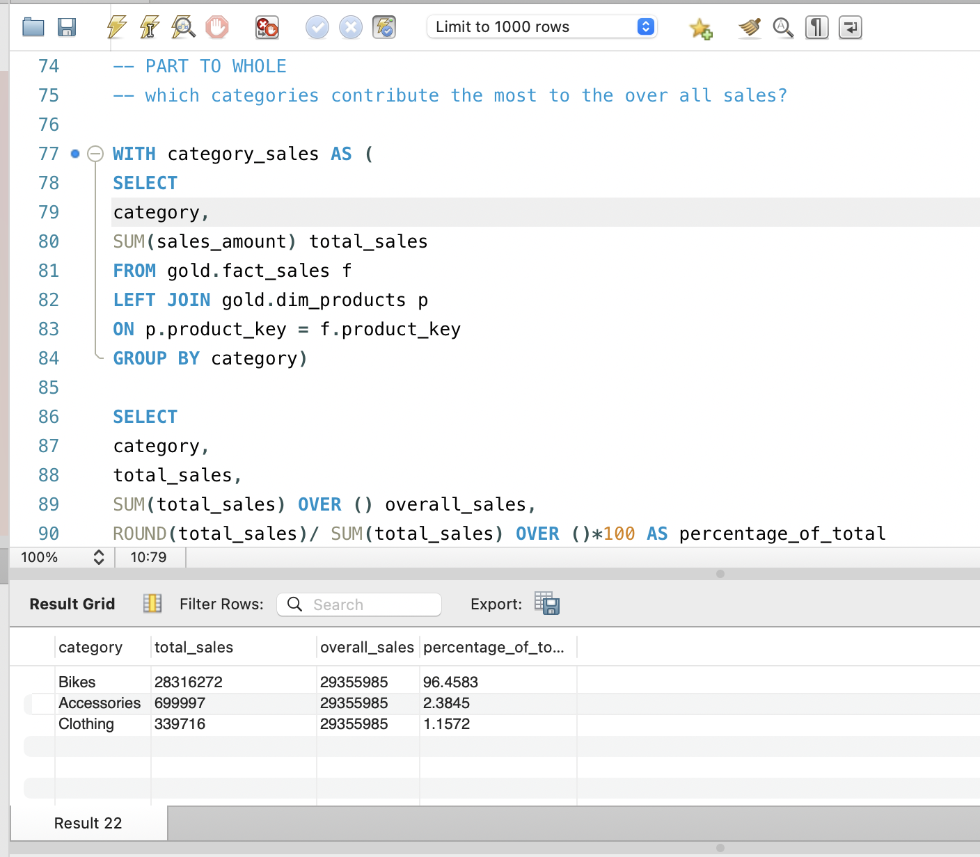
To understand which product lines drive overall revenue, I aggregate sales by category and compute both absolute revenue and the percentage of total sales. This part‑to‑whole analysis answers classic questions like “Which categories are our revenue anchors?” and “Do we rely too heavily on a small number of categories?”.
These insights support strategic decisions around assortment, marketing budget allocation, and opportunities for diversification or rationalization of the catalog.
6. Product Segmentation by Price Band
Recognizing that price positioning is central to merchandising, I segment products into cost bands such as “Below 100”, “100–500”, “500–1000”, and “Above 1000”. Counting how many products fall into each band reveals whether the catalog is skewed toward low‑priced, mid‑range, or premium items.
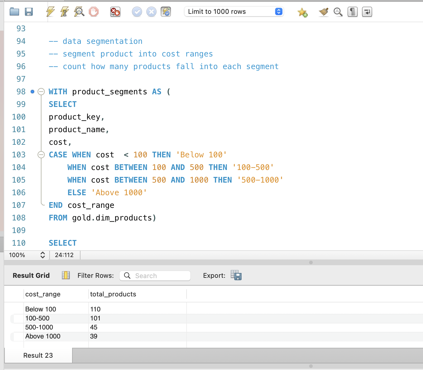
When these bands are combined with sales and margin data, they can show whether revenue is dominated by premium or budget items and whether the current price mix is aligned with the brand’s positioning and target customers.
7. Customer Segmentation and Behavioral Insights
7.1 Building Behavioral Features
For customers, I construct behavioral features by summarizing transaction history: total lifetime sales, first and last order dates, and a computed lifespan in months. These features capture value, tenure, and (with a simple extension) recency, forming the basis for richer segmentation and lifetime value analysis.
Because these features are computed directly in SQL on the Gold layer, they can be reused across multiple analyses and exported into modeling pipelines without changing the underlying schema.
7.2 Segmenting into VIP, Regular, and New
Using lifetime spending and lifespan, I segment customers into VIP, Regular, and New groups. VIPs have at least 12 months of observed history and high total spending, Regular customers have similar tenure but moderate spending, and New customers have less than 12 months of activity regardless of spend.
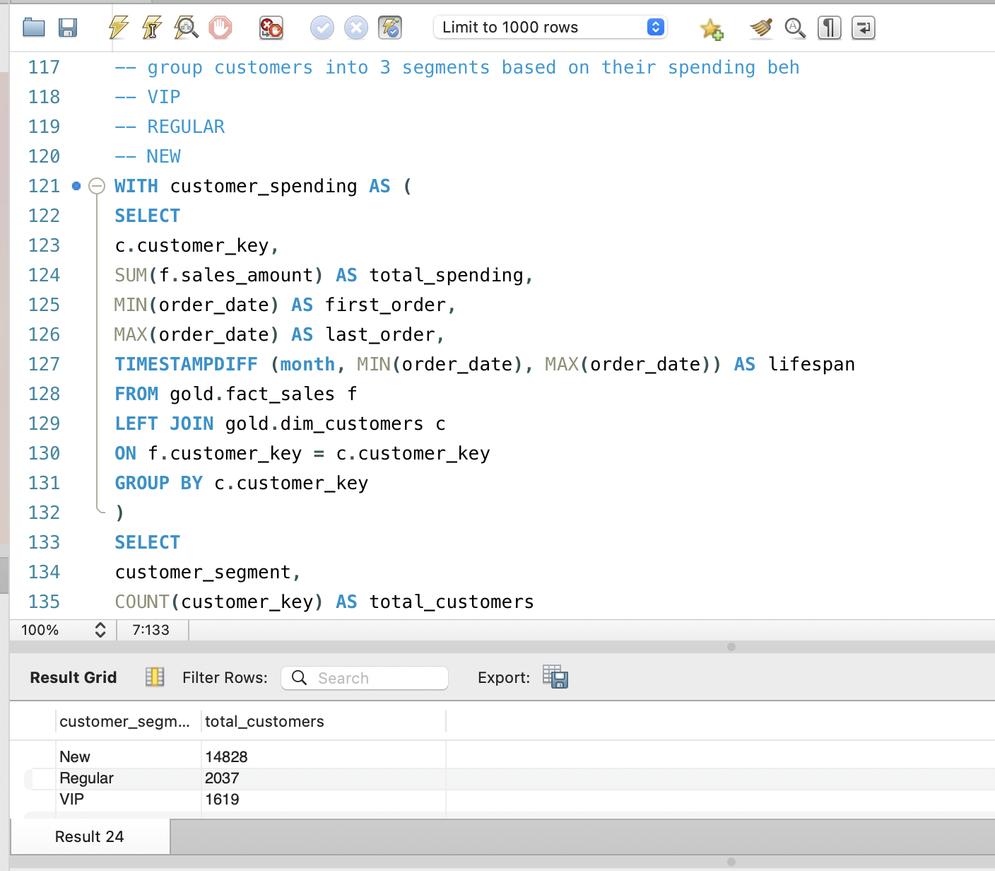
Aggregating counts and revenue per segment transforms raw transaction data into directly actionable groups for marketing and retention, and provides inputs for churn and upsell propensity models.
8. Insights and Business Impact
Across these analyses, the SQL patterns provide a clear picture of growth and stability over time, portfolio strengths and weaknesses at product and category levels, and how concentrated revenue is in high‑value customers. Because everything is computed in the warehouse, the same logic can power dashboards, ad‑hoc reports, and predictive models.
For stakeholders and hiring managers, this project demonstrates advanced SQL proficiency and, more importantly, the ability to think in terms of business questions, design appropriate metrics, and use window functions and aggregations to answer those questions cleanly and reproducibly.
9. Next Steps and Extensions
Natural extensions include adding recency metrics for full RFM scoring, building cohort and retention tables in SQL, combining price bands with margin to explore price elasticity, and exporting customer and product features for predictive models such as churn or upsell propensity. These build directly on the patterns established here and further strengthen the data warehouse as a foundation for both descriptive and predictive analytics.